
![]()
Echo basics: Key concepts
Latest instalment from the Echo Library
Key concepts and Doppler modalities
Echocardiography provides valuable insights into the heart’s structure and function through the use of ultrasound waves. In this article, you’ll learn how echocardiography operates, including key concepts such as frequency, wavelength, and amplitude of ultrasound waves. You’ll also learn about 2D imaging, M-mode, pulsed wave Doppler, continuous wave Doppler, and tissue Doppler imaging.
Amplitude and wavelength
If we look at the diagram below, let’s imagine our probe is on the far left, and it’s emitting this ultrasound. We can describe the ultrasound by its amplitude (or power). We can also talk about its wavelength (the length here for a whole cycle of the ultrasound).
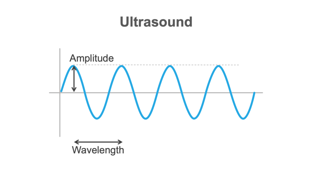
Frequency
And then we can talk about frequency, which is how many of these cycles we might get in a second. Frequency matters because it affects resolution, with high frequencies giving better resolution. So if the frequency is high, there’ll be a low wavelength.
However, the trade-off is that the high frequency waveforms have reduced penetration. So, you’re going to be making judgments about the frequency you want to use in a given situation.
The velocity of the beam depends on the characteristics of the medium it’s actually travelling in.
Creating echoes
Next, we’re going to think about how we actually make the echoes.
Ultrasound behaves in a complicated way, so we’re going to simplify it here. We’ve got a probe here against the chest, and we’re putting ultrasound into the patient.
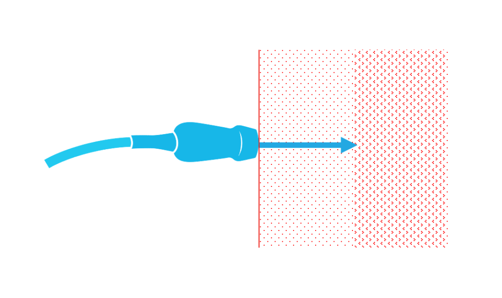
If you have tissues with different acoustic impedance and there’s a boundary between them, something happens to the ultrasound. Some of it will carry on and be transmitted. Some of it will be reflected.
The degree to which these occur depends on the different acoustic impedances of the tissues concerned. Muscle and blood have very different acoustic impedances. And bone, for example, has a very high acoustic impedance.
Anyhow, these reflective beams—these echoes—are what we’re interested in.
Now, the ultrasound is delivered in pulses. They go into the body, there’s a pause, and then they’re reflected back—the machine will wait for them to come back. The machine can use that time to work out how deep the echo has arisen from. So, in the diagram above, you can see a boundary between sections—the machine can tell us where that boundary is based on how long it’s taken for the ultrasound to get there and back.
And obviously the ultrasound that continues beyond that boundary (in the diagram above) can then give us information about structures deeper in the chest.
2D echocardiography
Below is a diagram representing a 2D image.
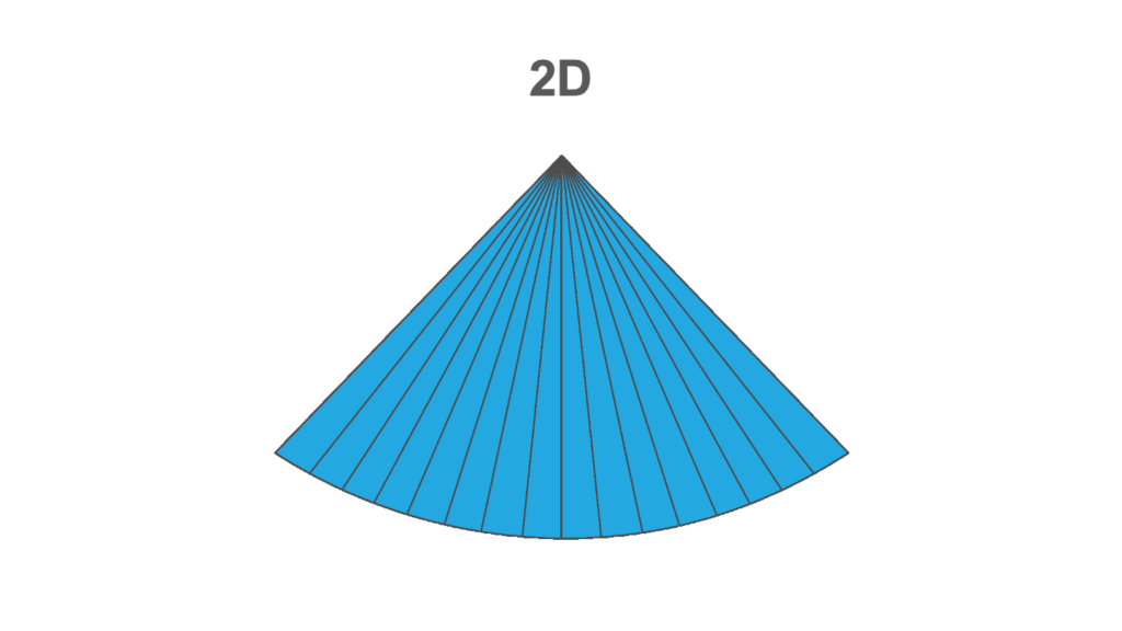
The probe is at the top. Each line extending downward from the probe represents the ultrasound being emitted. The machine is waiting for the beam to come back, and then it’s sending the next beam down. It sweeps across the sector from one side to the other. That has to be done frequently enough to give us the information required to assess the structures we’re looking at.
As an example, if your heart rate is 60, the mitral valve is going to be opening and shutting every second. We’ll want to see that several times, many times within that second, to know exactly what it’s doing. So you can see how this temporal resolution matters.
But you can also see that if you’ve got two structures next to each other, you need to be able to separate them. The width of those beams will affect that.
Axial resolution
The other thing we need to think about is axial resolution: how well can we differentiate a structure near the probe versus a structure that’s a bit further away. That’s dependent on the frequency of the ultrasound beam.
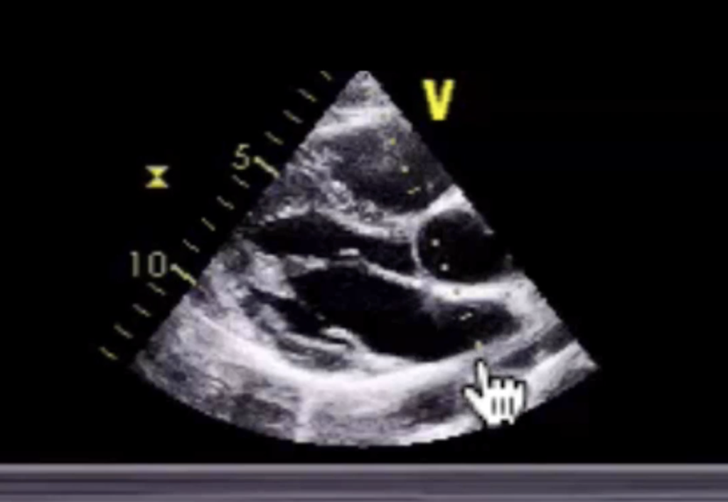
2D echo images
So this is what we see on a 2D echocardiography image.
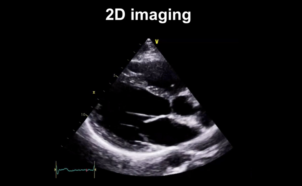
Just like the diagram you saw above, the probe is at the top of this image. And you can imagine there are scan lines that are coming down from the probe as the sector updates its image, progressing from left to right across the image.
M-mode
The next modality we’re going to look at is M-mode. So we’ve got our 2D echo image, just like we’ve been looking at up above. But if you look at the zoomed in image below, now there’s a line going down (marked by the hand icon).
What we’re doing is just looking at that beam.
And we’ve got a graph taken from that line through our 2D image. The image below is a zoomed out version of what you saw above. On the graph, the x-axis represents time, and the y-axis represents distance. We’re scanning through the aortic root:
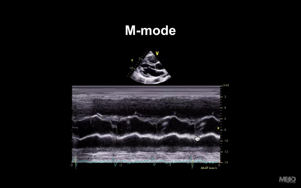
The 2 wavy-looking lines that run horizontally across the center of the image are the walls of the aorta. And the hand icon (above) is pointing at the bicuspid aortic valve.
In the image below, look where the hand icon is pointing now—you can tell there that our closure line is a bit off-centre.
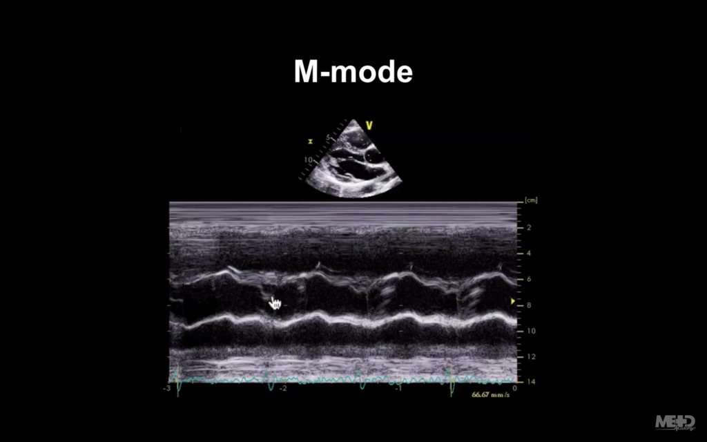
That is something that can be quite difficult to see on 2D imaging if the heart rate is very high. But on M-mode, because it’s so good at picking up motion, we can see this quite well. So there is still a role for M-mode, even though we don’t use it an awful lot nowadays.
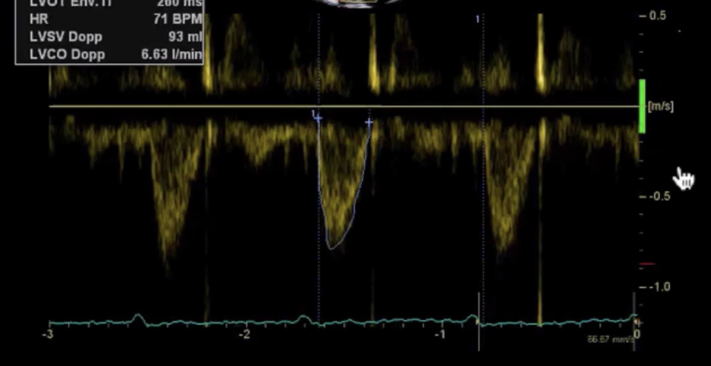
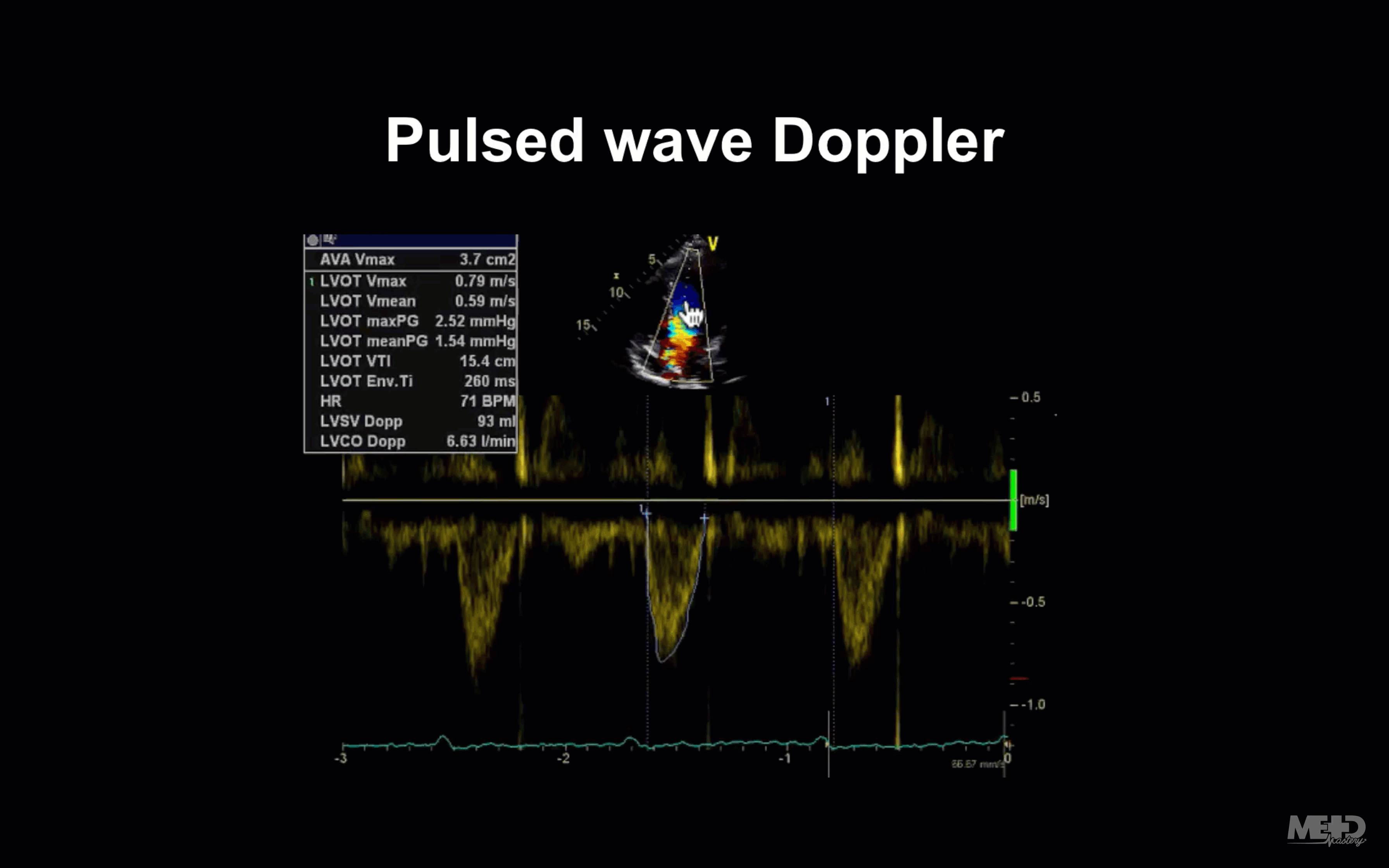
Pulsed wave Doppler
So the next thing we’re going to talk about is pulsed wave Doppler.
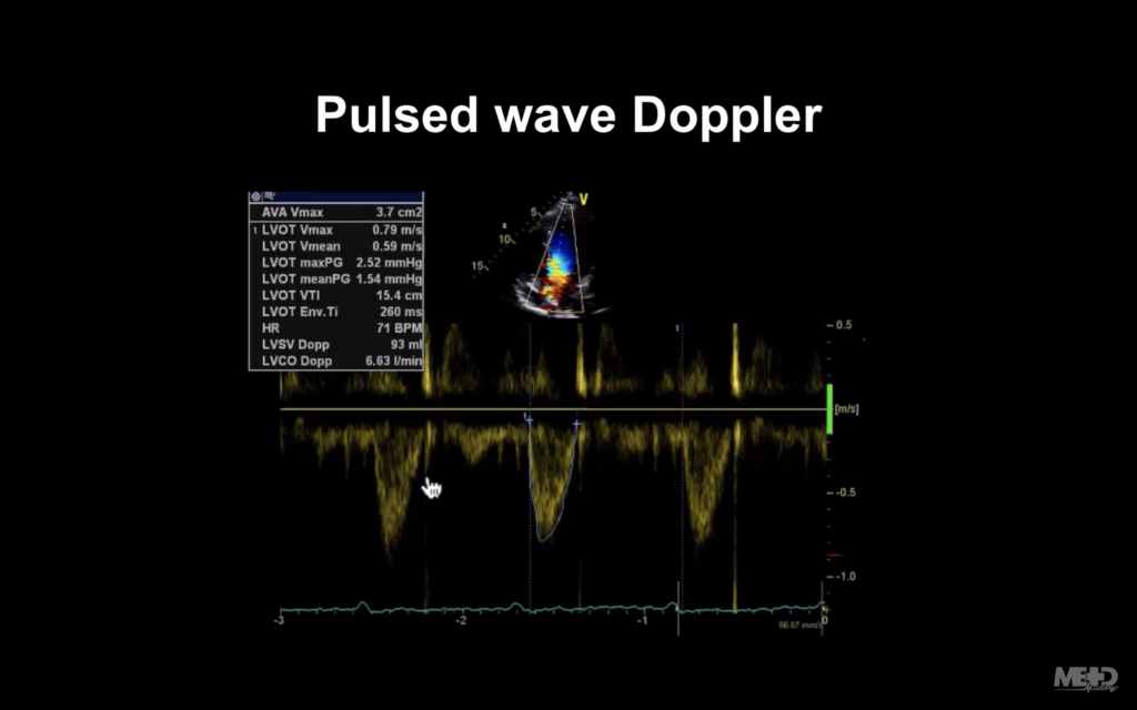
Notice below the two parallel lines that the hand icon is pointing to. Those show us that we’re sampling.
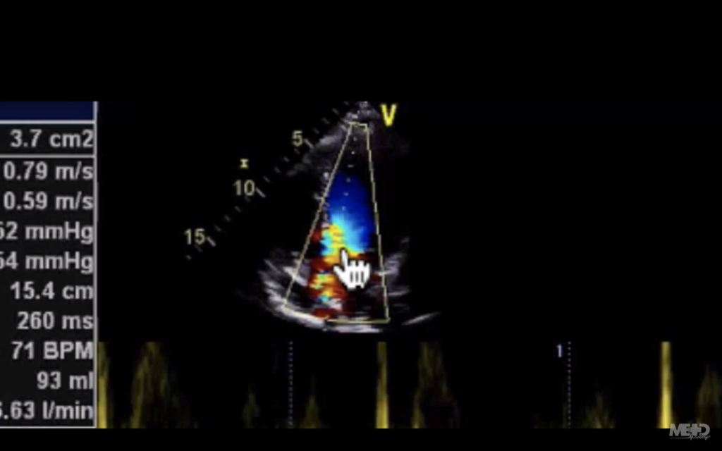
What’s happening there is we’ve got the probe up at the top of that image, and we’re sending ultrasound into the heart. But instead of using the tissues as our reflectors for the ultrasound, we’re actually bouncing it off the red blood cells.
If the red blood cells are moving away from the probe, the frequency of the ultrasound will diminish. But if they’re moving towards it, the frequency will increase.
The machine is able to convert these changes (Doppler shifts) into velocities (metres per second), which is displayed below on the y-axis. Time is displayed on the x-axis.
Doppler modalities only work well if you are perfectly lined up to flow (i.e. you’re parallel to flow).
Below, the hand icon shows the flow.
You can see in the image below that our line there is beautifully aligned to that. If it’s not, you will underestimate your velocities.

You can also see that there’s colour. So let’s move on and talk about that now.
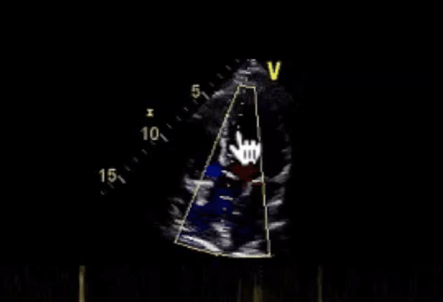
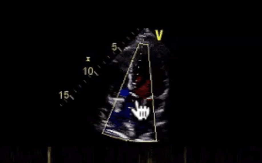
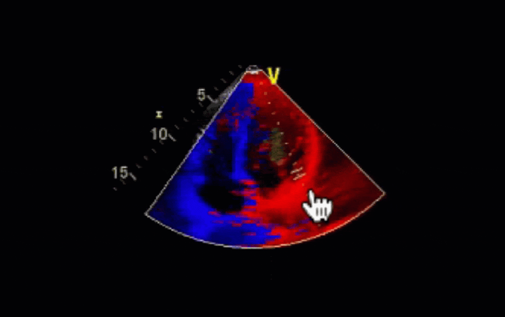
Colour Doppler
So this is a colour Doppler. Some people call it colour flow mapping. In the image below, you can see we’ve got a sector outlined in white—that’s our colour flow sector.
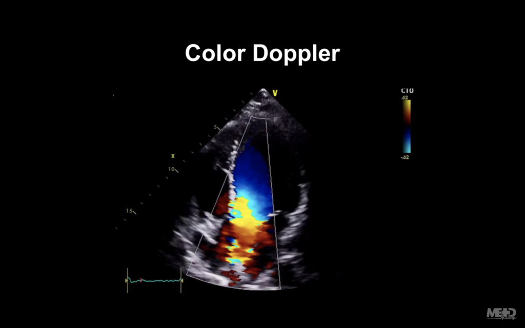
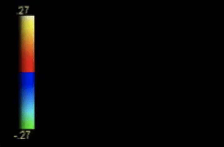
And what it’s doing is very similar to what a pulsed wave Doppler was doing. But instead of giving us hundreds and hundreds of little graphs, it’s actually giving us blobs of colour, or pixels, doing exactly the same thing. On the upper right of that image we’ve got a colour scale, which reflects the BART convention.
So let’s imagine our probe is at the top of the image. Blue represents flow away from the probe. Red represents flow towards the probe.
So any red blood cells travelling away from our probe are going to be colour-coded blue. With blood coming into the ventricle and towards the probe will be colour-coded red.
The actual shade of the colour will depend on the velocity of the blood cells. As things get faster, the colour gets more intense.
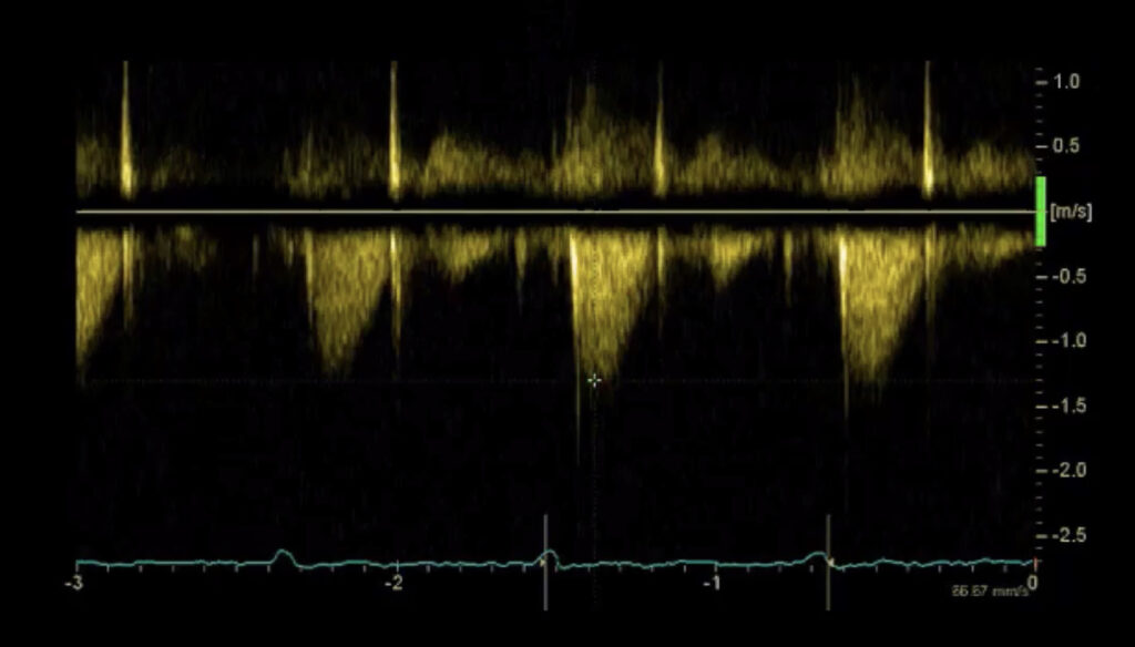
Continuous wave Doppler
Now we’re going to talk about continuous wave Doppler.
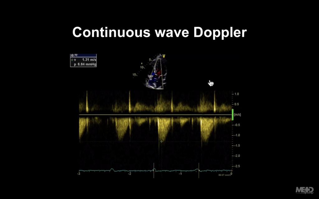
So again, let’s just start looking at our line through our image. You can see we’ve got a continuous line, all dots. There are no little tram lines like we have on the pulsed wave Doppler.
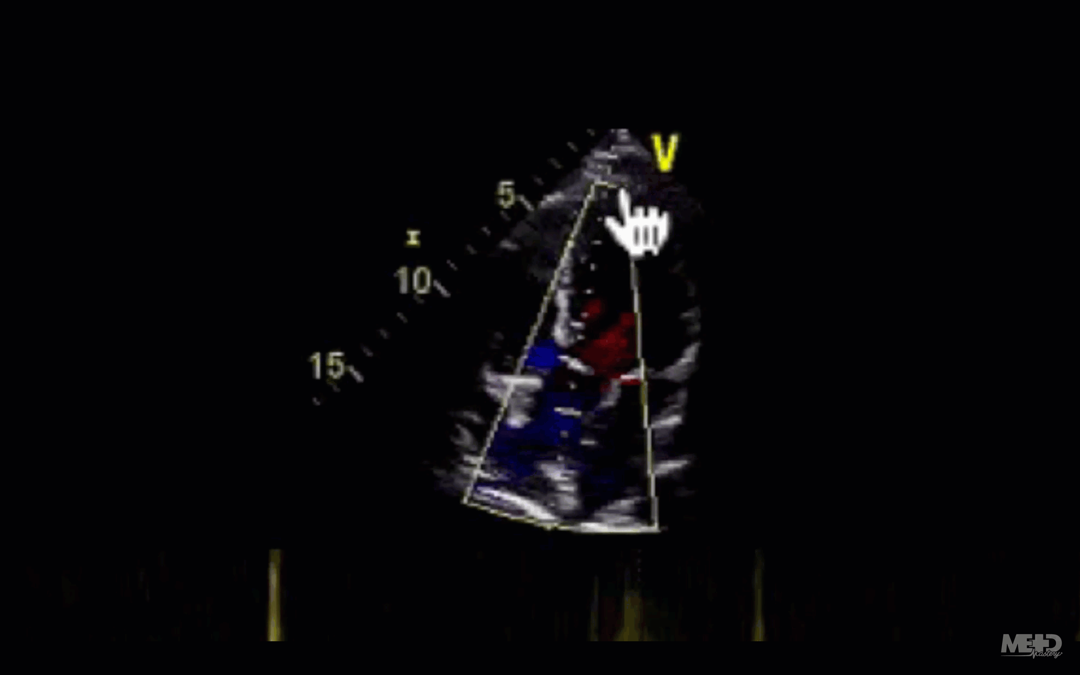
So what’s happening is the probe is emitting and receiving ultrasound continuously. That sounds great, but there is a downside to this: because it’s not sending out pulses and waiting for them to return, it can’t tell us the depth from which the ultrasound is arising.
As an example, look at these velocities I’m seeing here where the hand icon is pointing:
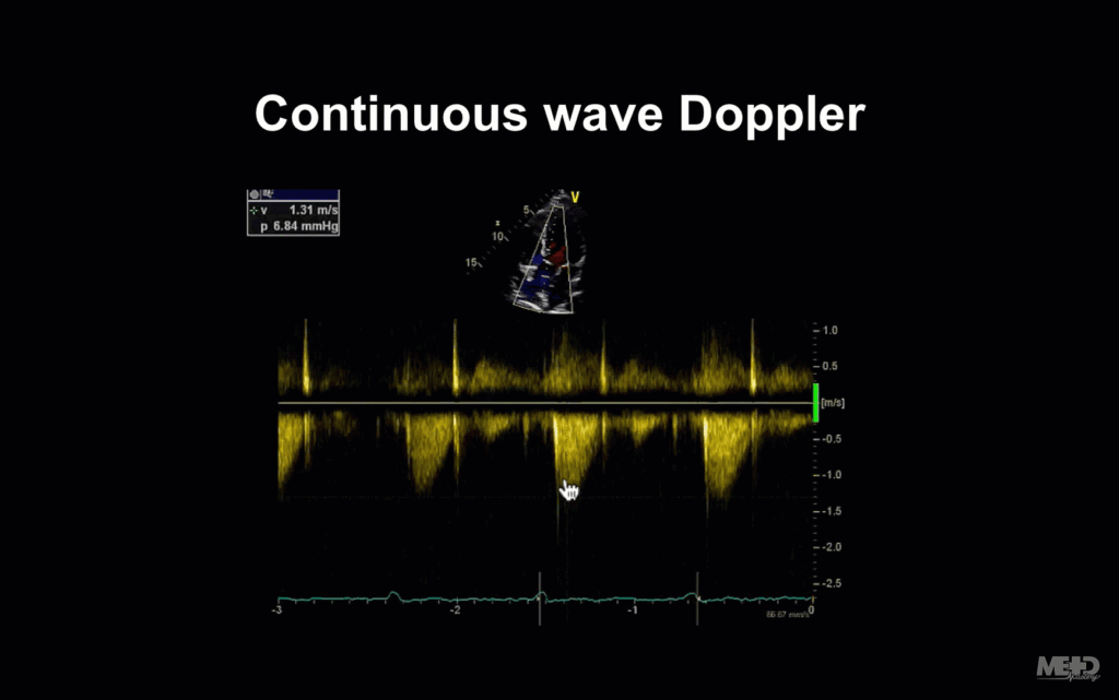
They could be coming maybe from the apex of the ventricle…
Or mid-cavity…
Or at the aortic valve.
You’ll notice the display is very similar to what we see in pulsed wave Doppler: Velocities are on the y-axis, and time is on the x-axis.
So you’re probably thinking, well in that case, I’ll probably just use continuous wave Doppler all the time, because at least I know where I’m getting my signals from. But unfortunately it’s not so easy.
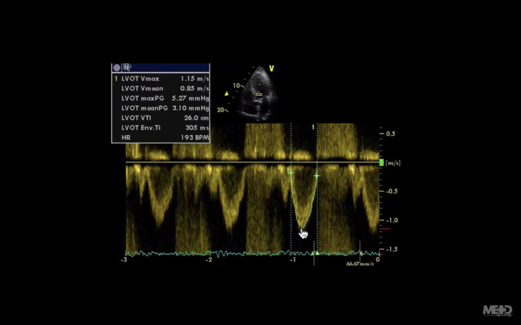
Pulsed wave Doppler example
So again, we’re now looking at a pulsed wave signal, and we can see that because we’ve got our little parallel lines there, showing us that that’s where we’re sampling from (we’re in the outflow tract of the left ventricle).
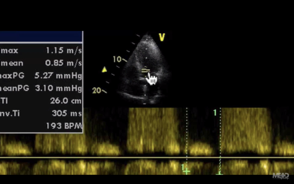
And it’s giving us this signal that you can see below (marked in green), that the hand icon is pointing to:
However, if you look below, there’s lots of what looks like a sort of crazy display.
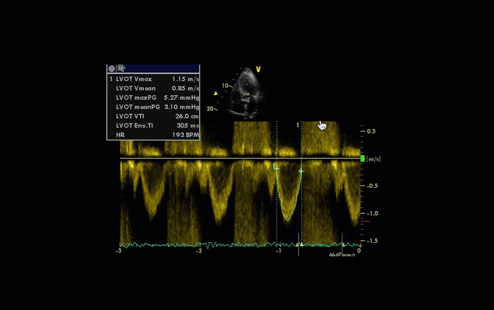
And that’s because this patient has aortic regurgitation.
Pulsed wave Doppler can display signals up to about 1.5 metres per second. But if it goes over that, it has a problem: because it’s waiting to receive ultrasound before it sends the next signal out, it can’t sample the signal frequently enough to display it accurately. And then what you get is that rather confusing sort of wraparound signal, displaying velocities both above and below the line.
We see something similar with colour Doppler, but in that case it can be quite useful. Why? Because that sort of crazy bit is just shown as a mishmash of high-velocity colour, which can attract us to turbulence or stenosis.
When to use continuous wave and pulsed wave Doppler
The trick is to use continuous wave and pulsed wave Doppler intelligently and sensibly, to play to their strengths.
- If you need to measure high velocities, you’ll be using continuous wave.
- If you need to localise, you’ll be using pulsed wave.
- And sometimes you’ll be bouncing between the two as you try to work out what’s going on.
Tissue Doppler imaging
The last modality we need to think about is tissue Doppler imaging.
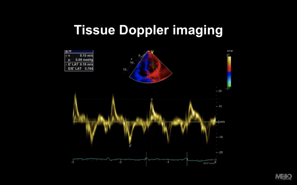
This shares a lot of similarities with the other Doppler modalities we’ve been talking about. But in this situation, we’re actually colour-coding the myocardium (i.e. we’re using the myocardium as our reflector instead of red blood cells).
In terms of colour, it uses the same BART convention that we discussed earlier: blue for flow away from the probe and red for flow towards the probe. But you’ll notice if you look at the colour scale, the velocities are much lower, because the myocardium is moving much more slowly than the red blood cells would.
One echo machine can do a number of other things as well. But if you use the modalities that we’ve talked about here, you’re going to be able to make a pretty good assessment of most cardiac abnormalities (and you can always ask for the other modalities at a later date if you require them).
This is an edited excerpt from the Medmastery course Echocardiography Essentials by Helen Rimington, PhD. Acknowledgement and attribution to Medmastery for providing course transcripts.
Additional echocardiography resources:
- Na, M. Echo Masterclass: Left Ventricular Strain. Medmastery
- Monteiro, C. Echo Masterclass: The Right Heart. Medmastery
- Eggett, C. Echo Masterclass: The Valves. Medmastery
- West, C. Echo Masterclass: Adult Congenital Heart Disease. Medmastery
- Naderi, H. Echo Masterclass: The Power of 3D Imaging. Medmastery
Radiology Library: Echocardiography basics
- Rimington H. Echo basics: Machines and probes. LITFL
- Rimington H. Echo basics: Tips and Tricks. LITFL
- Rimington H. Echo basics: Key concepts and Doppler modalities. LITFL
- Rimington H. Echo basics: Parasternal Views. LITFL
- Rimington H. Echo basics: Apical and Subcostal Views. LITFL
Echocardiography Essentials

Helen is a Consultant Cardiac Physiologist at Guy’s and St Thomas’ NHS Trust, in London (UK). She's also a co-author of Echocardiography: A Practical Guide for Reporting. | Medmastery