Urgent care flow
Speaking urgent care flow fluently
I have been doing urgent care data translation for NHSE Southwest as a specialty advisor to the Urgent and Emergency Care (UEC) programme since October 2022. It is not my intention to rewrite urgent care standards with this post. It is my intention to highlight a few important concepts which most of us forget in our pursuit of urgent care recovery. At the same time I hope to provide a fresh perspective on old concepts. This blog post will likely be of value to executive teams, operational teams and urgent care leaders.
I’d like to acknowledge the brilliant NHSE Southwest urgent care team, and specifically Millie Noble, our team project manager, who helped me make sense of the vast ocean of urgent care data, and how these connect to real patients.
A typical emergency department encounter
The simplest way to depict patient flow through an emergency department (ED) is the two-step approach shown in the image below. Patients arrive and are triaged, assessed and managed by the emergency medicine team (EM, blue); the larger portion (around 70-76%) of whom are also discharged by the EM team.
The remaining patients (around 24-30%) are referred (orange line), and then assessed and managed by specialty teams. Depending on the specialty team, some patients are discharged (green) and some are admitted (red). I’ll circle back to CRtP momentarily.
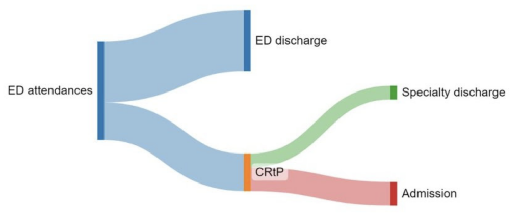
Within an efficient urgent care system, nearly all ED occupancy is made up by the blue workflow. This has not been the UK position for nearly a decade. At present the green, and more so the red workflows, can take up half or more of ED space! Despite little change in the referral proportion.
In general EM has accountability for flow from arrival to EM disposition (including referral and ED discharge); and specialty teams have accountability from EM referral to specialty disposition (including admission and discharge from ED). The operations team tends to share accountability with specialty teams for admissions.
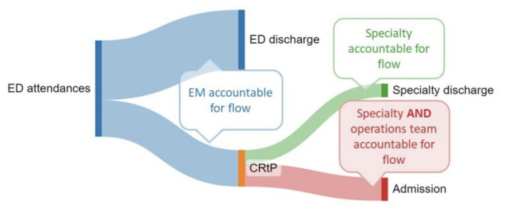
At present more specialty and operations activity are taking place in ED than ever before, complicating where to draw the lines of clinical accountability between these three groups. This is a problem. EDs were not designed to support specialty activity for such long periods. What is more, chronic protracted activity increases the risk of harm for patients within the entire system, not just ED. Let’s have a look at how this works.
The four harms
In urgent care, the risk of harm tends to increase across the system when turnover reduces below the baseline for any parts of the system. I find the four harms concept, as described by Ben Owens from Sherwood Forest Hospitals NHS Foundation Trust, the best way to unpick this. Ben says that harm in urgent care occurs when the following happens:
- Delay to disposition of patients using emergency numbers e.g. 000, 911, 999
- Delay to initial assessment (triage) in, and/ or offloading ambulances (Ramping) at the ED
- Delay to (EM and specialty) decision making in, and/ or admission from ED
- Delay to disposition from the ward when patients no longer require inpatient care (deconditioning)
It is important to note that the four harms are connected: delay in harm 4, contributes to delay in harm 3, contributes to delay in harm 2, contributes to delay in harm 1. We are now at a point where we have enough data to estimate the impact of some of these harms: severe harm is associated with 9% of patients ramped on an ambulance for more than 60 minutes and 30-day all-cause mortality affects 1 of every 72 patients boarded in ED for 8 to 12 hours.
The Royal College of Emergency Medicine (RCEM) describes some of the causes more specifically including “delayed recognition of priority, time critical conditions or deterioration, delays in treatment, treatment errors, high risk absconders, falls and pressure ulcers“. Several of these are also described in NHS Resolution’s thematic review of emergency medicine claims. Much of these are simply down to the patient being in the wrong part of the system for the care they required.
Let’s take a closer look at how patients end up in the wrong part of the urgent care system.
Urgent care turnover and crowding
Julie Gibbs from Frimley Health NHS Foundation Trust says that general efficiency at the front end of the urgent care system are measured in minutes to hours, whereas at the back end of the system it is measured in days to weeks. And as we already saw with the four harms: activity that reduces efficiency within a particular part of the system, that cannot be managed or contained there, results in upstream delay in other parts.
Each part of the urgent care systems requires a specific turnover rate in order for all parts to remain efficient. Put another way, we need to measure both the number of patients of each accountable group within a particular part of the urgent care system, and the time they spent there, to make sense of flow through the system. Turnover is an important concept to understand because it defines occupancy. Let’s look at ED majors and resus capacity as an example.
Although patients in the waiting room also require efficient care, it is those patients triaged to majors and resus spaces that require the most urgent care. The number of these spaces required are based on projected attendance numbers and a defined time any patient can spend in a majors and/ or resus space. In the UK architects use a mean of two to three hours for this calculation. In essence establishing the ED’s baseline turnover rate. A lower turnover rate means that patients end up ramped on ambulances, and boarded in corridors and other non-designated areas.
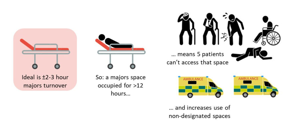
This is a concept that some operational and most specialty teams are not as familiar with as they ought to be. In general some might take comfort that the risk of harm is low for a specialty patient boarding in a majors space well beyond the baseline turnover rate. But this is because they do not consider the risk of harm that result from the patients who are denied that space (ramped on ambulances, and boarded in corridors and other non-designated areas). Multiply the number of specialty patients boarding in majors spaces and the risk of harm grows exponentially.
In the simplest possible way, understanding where delays in the patient journey is, and who is accountable, help us narrow down activity that contributes to harm. In ED, this requires measuring the activity of all workflows, EM and non-EM, and sharing this with all stakeholders in a meaningful way. In order to do this, we first need to understand a few things about data translation.
Data translation and urgent care
The purpose of translating data for decision makers is to enhance their engagement. If we translate data in a way that the majority of decision makers don’t understand, engagement will be low. In my opinion complex data translation is one of the key reasons we struggle to manage urgent care flow.
The image below is a slide I commonly use in my NHSE role to explain this point by using a Lego analogy. In my experience, nearly all decision makers need Duplo-level data translation. And yet, most presentations I sit through use nearly all Technic-level data translation. This won’t do. (for those lost in the abbreviations, LOS: length of stay, CRtP: clinically ready to proceed, UEC: urgent and emergency care)
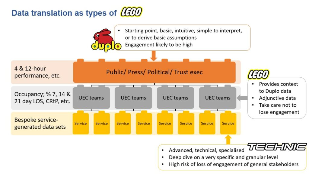
The best approach is to mainly use Duplo-level data translation, but being able to expand on this if necessary, using Lego-level, or (very carefully) Technic-level data translation. Where you know a group’s baseline knowledge is higher, you can tailor your presentation to a higher level of data translation. But be prepared to pivot back to Duplo-level data translation.
It should go without saying that specialty teams are unlikely to engage with anything more complex than Duplo-level data translation. And if you think putting together complicated Technic-level charts and figures are hard, try simplifying it to Duplo-level. The engagement pay-off makes it worth doing though. With that said, let’s look at measurement.
Measuring accountability in urgent care
Emergency medicine is held accountable for delivering all ED performance within 4 hours. This is challenging, and a bit unfair, specifically because specialty activity in ED has increased substantially; and EM has little to no agency over specialties’ ED activity.
The chart below is as Technic as I will go in this blog, but it is useful to understand this flaw in urgent care data collection. It is called a target associated flow (TAF) chart, originally designed by Chris Moulton, GIRFT clinical lead for Emergency Medicine. It depicts the proportion of patients over the time they spent in ED, for both those with an admission disposition (grey bars) and discharge disposition (blue bars). In the chart we can see around 53% of discharges occurred before four hours, and at the same time, that 79% of admissions occurred after four hours.
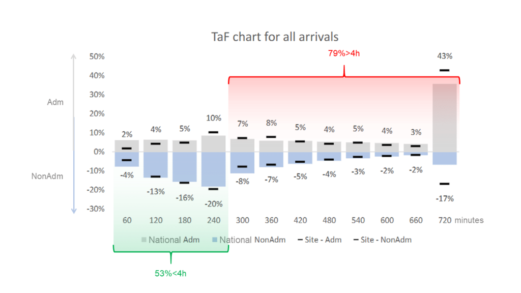
But who is accountable: EM or specialty? And how do we improve something we don’t measure? The short answers are: we don’t know and we can’t. (note that the chart is for a random trust for a random time period)
So how can we measure this on a Duplo-level? We have already said that turnover is key, and that turnover is a function of the number of patients and their time spent in ED. All we need is a data point where care transfers from EM to the specialty team with the appropriate scope of practice to provide further care. In my opinion this data point is time of referral. This is also how the GMC defines referral, and so do most internal professional standards (I’ll briefly comment on this in the next section).
How different would a TAF chart look if it contained only EM data from arrival to EM disposition? How would it look if it contained only specialist data for specific specialties from referral to specialty disposition? I’d say it would likely be really instructive, and probably quite useful for service improvement.
But it can be even simpler: for EM and each specialty with an ED caseload, we can simply track the number and mean time spent in ED per patient under each team’s respective care (using time of referral to split cohorts). This can be done in real-time (for operational purposes) and day-by-day, week-by-week or month-by-month (to track service improvement for each clinical team operating in ED).
There are of course other data points in use. Clinically ready to proceed (CRtP) is such a data point. However, CRtP has more to do with safe transfer between hospital areas, than clinical transfer to specialist care. Ironically, a fair number of EDs use time of referral as a proxy for CRtP. Decision to admit (DtA) is another data point. It skips all the activity that occurs between time of referral and specialty admission decision being made and only tracks activity once triggered. It therefore also ignores discharge activity, even though this makes up at least half of some specialties’ ED workflow. These are not metrics that support specialty engagement.
Internal professional standards
I’ll be really brief. Internal professional standards (IPSs) aim to describe how teams collaborate and communicate with each other in hospitals, usually with a strong lean to urgent care. Past iterations didn’t work as the language used was perceived by specialties as patronising and militant. Many hospitals have therefore reworked their IPSs. And although most newer IPSs include ten or more standards, there are really only two that matter, largely as most stakeholders already agree about the others.
These two are: when care actually transfers following a referral (at the time of referral, once the specialty starts their initial assessment, once they make a decision or some other point). And what is meant by a timely initial assessment following an acute referral (expect replies to range from minutes to days).
Medical directors can save time establishing IPSs by negotiating these two standards first. To do so, they will likely need access to simple data translations.
Summary
It is complex to consider urgent care, elective care and all the other recovery that is required within the current health and social care environment. There is very likely not enough capacity in the system for all recovery to happen at once. Improving within such an environment requires targeted intervention. This is simply not possible without better data translation.
Everything I described in this blog post has been simplified. There are a lot more nuance to get lost in, which will help no-one if pursued before taking a simpler view. Data are not cruel or emotional. It just tells us how things are. The choice to engage is ours. Making the choice to engage easier, by simplifying data translation is a key ingredient for improvement.
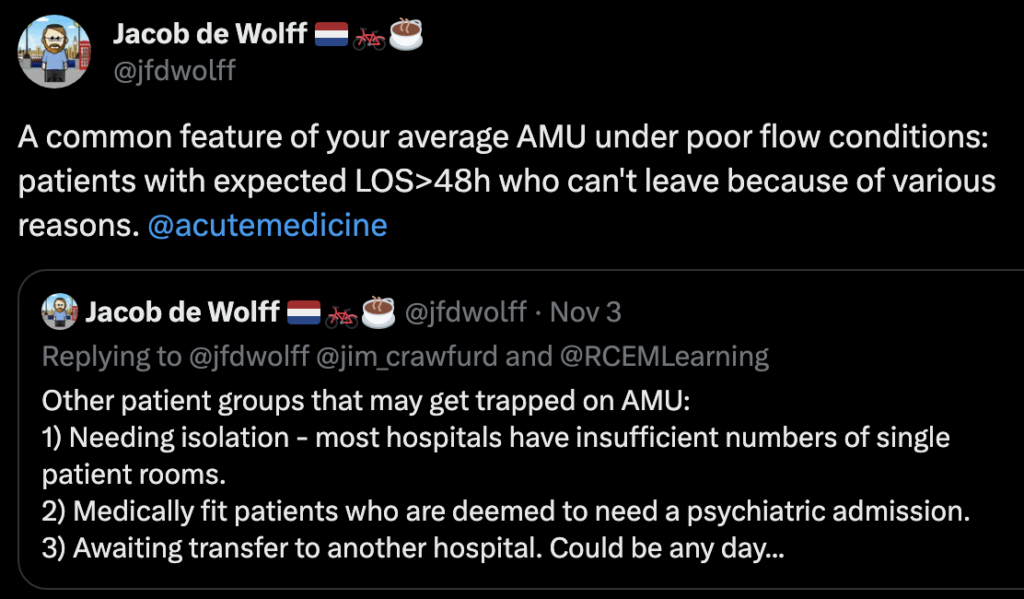
Most of the principles explained in this blog can also be applied to other parts of the system that rely on turnover. Just like Jacob de Wolff did here for acute medicine.
References
- Learning from Emergency Medicine compensation claims. NHS Resolution. Date published: March 2022
- Jones S, Moulton C, Swift S, Molyneux P, Black S, Mason N, Oakley R, Mann C. Association between delays to patient admission from the emergency department and all-cause 30-day mortality. Emerg Med J. 2022 Mar;39(3):168-173.
- Delayed hospital handovers: Impact assessment of patient harm. AACE. Date published: November 2021
- RCEM Acute Insight Series: Crowding and its Consequences. 2021
More urgent care data translation ideas
There are many other ways to make sense of the data in simple ways. For a start, it may be useful to decide on language used to describe ED and EM.

Chris Pickering uses metrics from the NHS emergency care dataset to describe the delays for each of the four harms in the West-Midlands. When viewed over time the connection between these is very clear. We do the same at NHSE Southwest, but start with harm 4. I’d love to show you, but there is no way to do this without also sharing sensitive data. I am happy to be contacted about this though.
In addition to creating TAF charts to evaluate specialties’ ED data sets, you will probably benefit from a 24-h distribution chart as well. This can help you track when referrals are more likely to occur, as well as when time of referral to disposition (I call this outlying time) starts to creep up.
Total (or aggregated) outlying time (real-time, or daily mean) is also likely to be useful to medical directors negotiating IPSs between teams with less understanding how delays in urgent care flow contributes to a collective rise in the risk of harm.
Perhaps you have some examples of simple data translation used in your organisation, or ideas to improve data translation. If you do, please post in the comments below.
Further reading
- Bruijns S. Thinking pragmatically about capacity. St.Emlyn’s
- Bruijns S. Cardiac output as a metaphor for flow through an urgent care setting. St.Emlyn’s
- Ferguson C. Changing Clinical Standards for Emergency Care. St Emlyn’s
- Bruijns S. JC: To batch or not to batch? Managing flow in the ED. St Emlyn’s
- Bruijns S. JC: Improving patient flow. St Emlyn’s
** This post was also published on St.Emlyn’s blog
SMILE 2
Better Healthcare
Consultant emergency medicine MBChB, DipPEC, MPhil, FRCEM, PhD. Emergency physician, Yeovil District Hospital. Clinical advisor, UEC Bundle Implementation, NHSE Southwest, UK. Specialist advisor, CQC Urgent Emergency Care, UK. Honorary associate professor, Division of Emergency Medicine, University of Cape Town, RSA. Past editor in chief, African Journal of Emergency Medicine
